Date Range Picker
Properties
| Atribute | Description | Type | Required |
|---|---|---|---|
| value | Will be used as default value. It's an array with 2 date values. | Array | Yes |
| placeholder | Placeholder if both values and placeholder are provided, value will be used | String | No |
And all the common properties for all components.
Example
{
    category: 'content',
    type: 'dateRangePicker',
    propName: 'rangedate',
    label: 'Range date',
    placeholder: 'Pick a range of date',
    value: [],
}
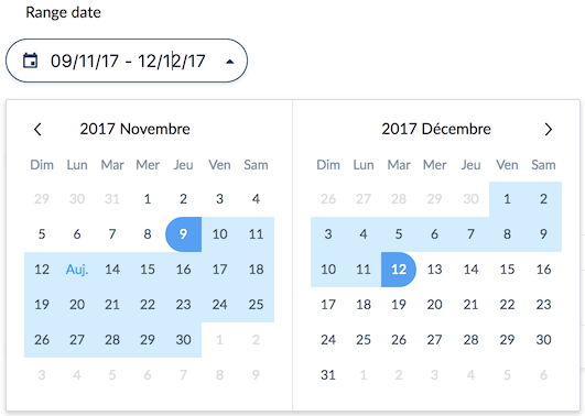
Will render: